


- Product
- Resources
- Customers
- Company
New Phone, Who Dis (aka Mobile Optimization)


Want to put this in action?
See why companies like Qualtrics, Snowflake, and Autodesk use Mutiny to hit their growth goals.
1:1 ABM personalization made easy
See how marketers at Uber, Amplitude, and LaunchDarkly use Mutiny to engage target accounts at scale
YOUR MISSION
- Discover mobile journey opportunities
- Launch a banner on mobile to drive more conversions
- Launch a mobile optimized page
- Launch a sidepop to drive conversion for desktop visitors
WHAT YOU'LL LEARN
- How to optimize your mobile pages for conversion
- What the user journey looks like on different device types and how to meet visitor needs
WHAT YOU'LL NEED
- Comfort with killing your darlings - simplification is the name of the game!
- A mobile phone to review your mobile site
- A need for leads
Before getting started: The stuff covered in this chapter builds on what you built in previous chapters (we recommend starting there if you haven't done it already).
Why this segment?
Making your site responsive is not enough to “optimize for mobile”. Visitors on their phone are often on the go and you have a much tighter time window to convert them.
Your goal is to simplify the content and succinctly communicate the value of your product.
Mutiny customers see an average increase in pipeline of +35% when personalizing for mobile visitors.
Let’s get to it!
First things first - let’s take a look at what mobile traffic is doing on your site. Go to the Data Explorer, select “Device Type” as the attribute, and click on the arrow next to “mobile” to break down your mobile traffic by the pages they visit. Find the pages where you have the most traffic and add them to your plan.
From your plan, you can click the “Launch” button to automatically create the segment.
Now, for the experiences.
Add a sticky CTA
Have you ever been on a website on your phone and had to scroll alllll the way up or alllll the way down to find a button? Well, let’s make it easier for your mobile visitors.
Create a banner experience for mobile traffic to add a sticky CTA.

Your CTA should be suitable for where the visitor is on your site and in their journey. If they’re on a top of funnel blog page, it might not be the right time to ask for a demo. Keep them moving in the right direction and offer another content piece instead. If they’re on a product page or bottom of funnel asset, then it may be appropriate to ask for a demo or a free account signup. Align your sticky CTA with existing page CTAs for consistency.
🔥 Hot tip: Test before launching
Use the toggle at the top of the editor to view the experience at a mobile breakpoint.
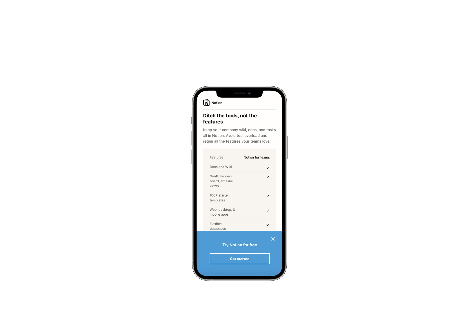
Delete unnecessary page content
Next, let’s create a personalized page experience. Create a personalized page for your most visited page on mobile.
Mobile users are more likely to scan a page than read it in its entirety. Delete as much irrelevant content as necessary and strip the page down to essentials.
We've done this with our homepage so that the logo bar appears above the fold and the formatting works better on a small screen.

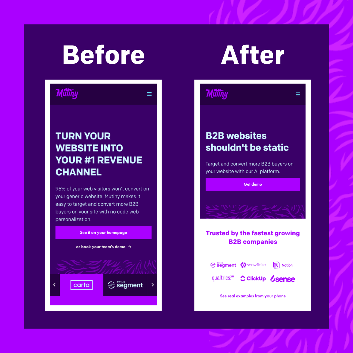
Shorten your headlines to as few words as possible, no more than 2 lines. Use action-oriented language to encourage visitors to take action.
If you can, replace paragraphs of text with bullet points. Make it easy for visitors to find and absorb the information they are looking for.
🔥 Hot tip: Be your own visitor
Pull out your phone and take yourself through the journey on your mobile site. Look out for some optimization opportunities:
Form below the fold
Too many CTAs that make it unclear what to do
Headlines don’t match what prompted them to go to that page
Too many words/paragraphs not easy to quickly absorb
Optimize for Desktop
Finally, let’s share the love with desktop visitors. Generally, those on desktop are much more likely to convert so let’s give them a little nudge. Create a sidepop for desktop visitors and drive them towards your signup pages.


What's next?
We will let these bad boys collect some data and check back in on how they are doing in the next few weeks. In the meantime, let’s build some behavioral audiences.
Learn | Connect | Unlock
Unlock all the exclusive templates by joining the community purpose-built for modern marketers
We've created ready-to-use templates that you can use to immediately action the concepts shared in the Academy. These templates are only available to members of the M2 Community.
What M2 members get
Approved members get access to...
Slack channels & DMs with vetted peers
In-person dinners with local peers
Virtual roundtables to share learnings
Access to proven playbooks from community members
Ready to join other marketers from these B2B brands?